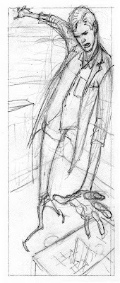

Patrick Wedge made a passing reference to this cover in the comments for the Weird Western sketch. Small wonder that Geof Darrow picked idea number three. The others were pretty weak.
A random collection of material from comic artist Kevin Nowlan. Started with the best of intentions, but like most other efforts, doomed to perish from neglect as soon as the novelty wears off.


 The evolution of a cover, from Mike Mignola's sketch to intermediate layouts to final pencils and inks. The three panels at the bottom were dropped when they didn't work on the cover of #1. I liked them but Mike thought they were getting in the way.


 You can see me struggling with the first panel here. The pose in the preliminary sketch almost works but it's a little weak.


 Be sure to click on the thumbnail to see the larger image. Seriously now, have they ever looked better?
