Monday, August 31, 2009

My new friend

We get along much better now that he's outside where he belongs.

He fluttered through our bedroom around midnight but when we turned on all the lights and opened the front door he decided to take a nap on the wall over above our bedroom door. I'm glad he was able to sleep because we sure couldn't.

I tried to shoo him away with a broom but he just hissed at me and showed his sharp little teeth.

Finally, around 5:30 I improvised a Bat-net® and moved him out the front door as gently as I could.

The ride shook him up a little but he eventually recovered and flew away, after posing for a quick photo or two.


Dr. Strangefate, page 5

In hindsight, I should have been intimidated by these pencils but for some reason I wasn't. I guess I realized that they were idiot-proof and that no matter how badly I messed up the pages would still look great.


Saturday, August 29, 2009

Friday, August 28, 2009

Jack B. Quick: "Smalltown Stardom" pencils, page 3

I just realized how much I redrew panel three. Hard to believe I'd draw two complete figures and then erase them for the closer shot but there it is.


You better not be usurpin' the Almighty's divine option again!

Thursday, August 27, 2009

Monsters in the Closet: page one


The pencils were really tight on this page. I was nervous and didn't want to leave anything to chance.

It's a favorite page of mine, even though it's almost all buildings and we don't see much of Batman. It created the effect I was aiming for; a slow pan shot of Gotham City, zooming in on one window, then following the muck down to the street.

You're not supposed to notice Batman when you first look at the next-to-last panel. You see him in the last panel and then go back and see him standing in the shadow in the previous shot. Sneaky...

In spite of my efforts to create a cinematic effect here, this is comics, not film... so I think going backwards like that is allowed.

Wednesday, August 26, 2009

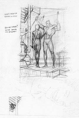
Batman & Catwoman pin-up


This was for Batman: Legends of the Dark Knight #50. As I've probably mentioned elsewhere, these pin-ups were usually wide open, with an editor calling up and asking for a drawing but leaving it to the artist to come up with an idea. I don't know where this one came from. I think I just started sketching Batman standing there and the other elements started to appear. I remember Archie Goodwin commenting on the mouse in the trap and Robin's expression.

Tuesday, August 25, 2009

Jack B. Quick "Flying Cats" pencils, page 5


For some reason, I made copies of the pencils for this page at three different stages. My suspicion is that I didn't do a tight, preliminary, letter-size layout so I was working those things out on the 11 x 17" board.

In the first panel, I moved the balloons around to show the dormer and the edge of the roof. In the second, I realized I needed larger "display" lettering for the chanting pigs.

I think you can still see that Mr. Murk is smiling in panel five, even though he's facing away from us.

Monday, August 24, 2009

Superman Gallery cover sketch

I found this pencil sketch for a wrap-around Superman cover that I did back in the early '90's. The editor, Mike Carlin, didn't ask for anything specific so I suggested a big robot battle.


Sunday, August 23, 2009

Rough sketches for an old Defenders commission


Looks like this one was done in 2003. I couldn't find a scan of the pencils so I'm showing three stages of layouts along with the final inks. It might seem like a lot of preliminary work but sometimes it takes me several revisions to get everything worked out and it's always better to make those mistakes in the sketching stage than it is when you're doing the finished art.

Saturday, August 22, 2009

Superman card art


This one seems to be a little Mignola-inspired. I like the lighting effect but the flat colors didn't go over very well with a lot of the card collectors who wanted "paintings".

Friday, August 21, 2009

Curses! Broiled Again!

This was drawn for Andy Helfer's Big Book of Urban Legends back in the 90's. I also did the lettering.

Even though we don't see much of it, I tried to get a Miami Deco look to the architecture.

I think I was on a bit of a chiaroscuro kick at the time. Why else would I go to all the trouble with the high contrast lighting in panel three? By the way, in conversations I always avoid using the word "chiaroscuro" because I can spell it but I can't pronounce it.

The narrator is Jan Harold Brunvand, the real life author of the Urban Legend books. They sent me a photo for reference. I like the bit of business with him plugging in the tanning bed. I think it was in the script but I don't remember for sure. Not that it's particularly interesting or funny... it's just better to have people doing something, especially if the alternative is having them just stand there and talk with their arms at their side.

I don't know what the little shmuts is on the floor below the outlet in panel one. I guess I didn't want the floor too clean for some reason.


Thursday, August 20, 2009

Jack B. Quick (and Batman) cover art for Comic Book Artist magazine

Update: Here are some thumbnails and a larger layout for the cover. I forgot I had these!


My buddy Robert Jewell suggested the flying contraption that Jack cobbled together. Sorry I don't have a larger scan of the pencils.


Museum of Oddities, page one

The discussion of hand-lettering got me thinking about this one.

The first notion was to do a Haunted House story but it evolved into something a bit more cheerful than that.

I had a lot of fun drawing it, mainly because Jeff Parker is one of those generous writers who tries to play to an artist's strengths.

The house is based on a real building, located a couple of blocks from here. I changed it a little but the basic shape is the same.

Working out the details on the title/poster images was the biggest challenge here, but I think they add a lot to the splash so it was worth the trouble.

The Marvel office not only let me do my own hand lettering, right on the board, but they let me do the colors and seps too. I kept it mostly flat but put in a few graduations/airbrushing here and there. My model for coloring is still the Silver Age comic covers at DC. With Photoshop, it's hard to know when to stop, but I still want the coloring to look like old comics, without the big dots.


Wednesday, August 19, 2009

Don't try this at home

You know, this is putting an awful burden on someone who just draws stuff with little thought of who – if anyone – might see it or even if it's worth being looked at more than once.

My first reaction was, "No, if I'd known you were going to do that I'd have done a better drawing!"

The artist did a nice job though... I like the addition of the Bat Signal. If anything, I think he improved the drawing.


Monday, August 17, 2009

Jack B. Quick original art

This page really cracks me up. Poor Teddy.

Since he had to be recognizable from ages 8 to about 48, I gave him a distinct haircut and very recognizable facial features.

I tried to make the scan large enough so that you can see the notes and corrections. I haven't been able to find any copies of the pencils but if they turn up later I'll be sure to post them as well.

I remember struggling with the layout on that last panel. It wasn't an easy action for me to work out but I think it gets the idea across. On the other hand, if I had it to do over, I might not show Jack smiling as he delivers the line. His standard scowl probably would have worked better.


Mike Mignola's Clayface pencils

Back in the mid-80's, when Mark Waid was editing Secret Origins, a friend told me that he'd caught a glimpse of my next inking project. Mike Mignola had pencilled a Steve Purcell script for the origin of Clayface and I was going to ink and color it. Okay, sounds good to me. I was confused because I hadn't heard anything about it but the friend assured me that he'd seen my name lettered in the credits.

It got weirder.

Months later, when I asked Mark about it, he said the story had been killed. The script was hilarious, as you'd expect from the creator of Sam and Max, but DC felt that it was undignified for Batman and Robin to be referred to as "a couple of costumed pansies" and other humorous bits that were less than reverential.

So the pencilled, lettered pages were put on a shelf. They eventually made their way out the door when an editor sent them to an inker in Canada so that he could "practice" on them. Yowza.

Flash forward several years. Mike's talking with a new editor at DC and suggests tracking down those boards so the story can finally be published. A few calls are made and the art is returned to DC, un-inked but slightly water damaged in places.

Mike considers inking it himself but changes his mind when he looks over the pencils and says, "I don't even know the guy who pencilled this!"

So he asks me if I want to take a crack at it and of course I agree.

Years earlier, Mike had been disappointed with my inks on an Alien book we did because he was hoping I'd really go to town with the rendering and shadows. He thought I'd inked it straight, which really wasn't what he was looking for. I assured him that I'd try to "fix" things if I could find anything that really needed it.

Fast forward again, a few months later. The pages are once again at DC, but this time they're inked and the objecting editor has moved on, so it's finally going to get published, right? No, not yet... they don't know where to put it since Secret Origins has been cancelled and it's too short for a book by itself. How about putting it together with the Ron Marz, Berni Wrightson Batman vs Solomon Grundy story I inked? The editor's eyes lit up... "Yeah! Let's do it!"

Well no, that would make too much sense for a project as cursed as this one.

It finally saw print years later. Some of you may have seen it, buried in a Batman villains issue of Secret Files, but it was easy to miss. If you can find a copy, check out the dialog. It's laugh-out-loud funny and whole chunks of it were taken from the original Clayface story published back in the '40's.

Sunday, August 16, 2009

Batman Manhunter cover art


From 2006. I'm surprised I went with a white background. I must have been trying to play up the contrast with Batman's dark costume.

Saturday, August 15, 2009

An Alex Toth original


These days there are strict rules for returning original art to the artists after the publishers are finished with it. We have Neal Adams to thank for the fact that art is no longer warehoused, shredded, given away by editors, or turned over and used as paste-up boards for house ads like this oversize Alex Toth original from 1963.

Someone took a black grease pencil or China marker and drew big "X"s across the front and glued stats to the back for an ad.

It's a shame, because Toth's art is beautiful. He inked it with real India ink, not the less-than-permanent markers he started using almost exclusively a few years later. There are some really effective dry brush textures on the cape in the last panel as well as the explosion in the panel before it. Toth lettered the sound effects but the rest of the text is by another hand. Nice art, given to me many years ago by inker extraordinaire John Nyberg.